RubberBond Solutions’ color palette is rooted in nature, durability and design restraint. Green, blue and black serve as the foundation of the brand, chosen intentionally to reflect the outdoor environments where RubberBond Solutions products live and perform.
ADA color compliance is critical to ensuring RubberBond Solutions is accessible to users of all abilities, supporting clear visual contrast for way finding, navigation and safety. Thoughtful color contrast meets regulatory standards and creates inclusive environments where everyone can move, play and engage with confidence.
Graphic Elements
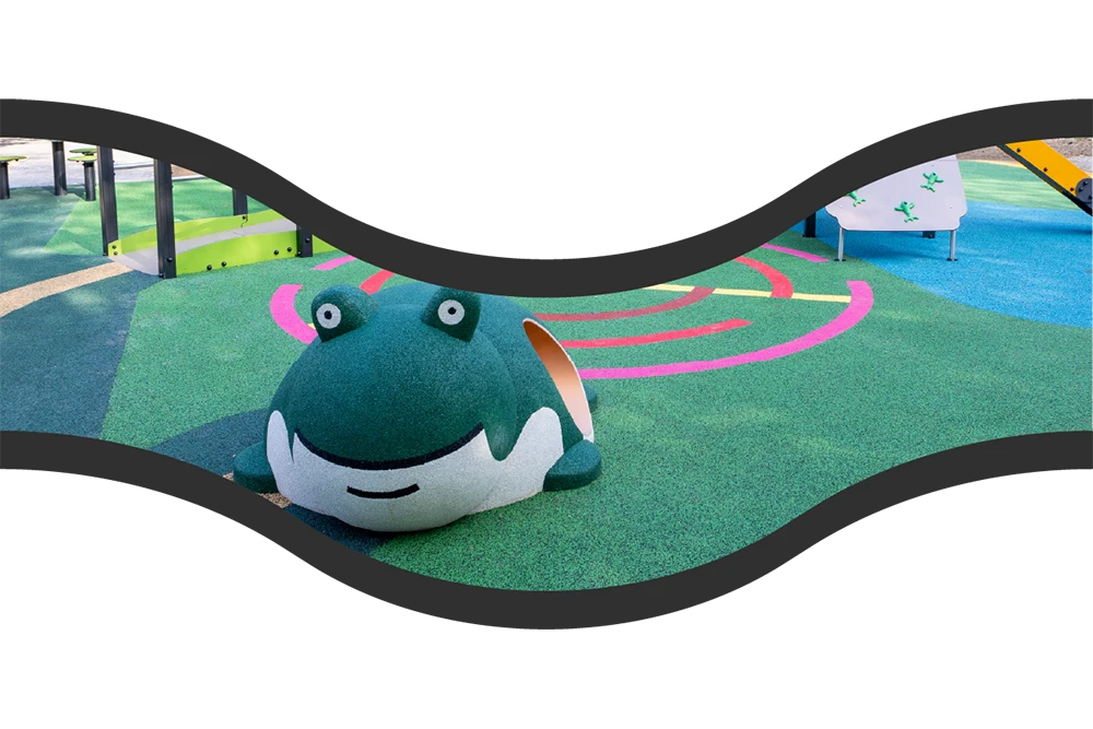
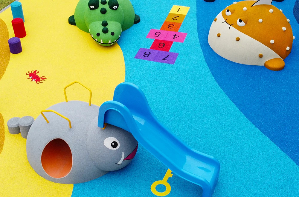
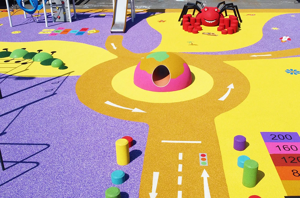
RubberBond Solutions’ visual language is rooted in organic forms, soft curves and fluid transitions inspired by poured-in-place rubber environments. Graphic elements emphasize movement, approachability and spatial flow, often using top-down or environmental perspectives to highlight layout and experience over individual components. This system creates an immersive, grounded look that supports bold design without competing with it.
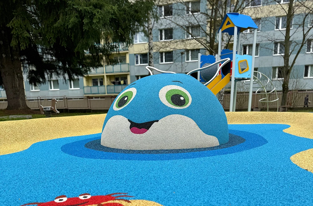
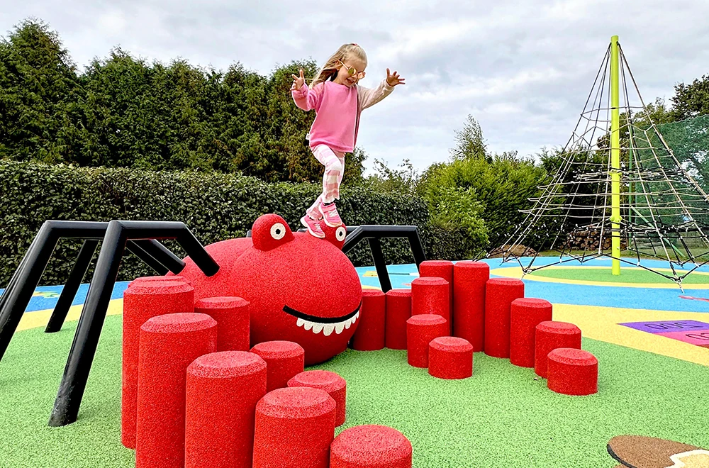
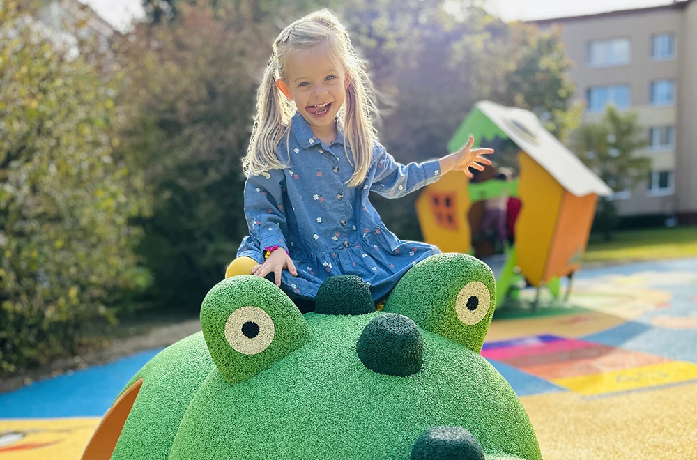
RubberBond Solutions photography and videography should capture real environments in use: authentic, active and grounded in context. Images and videos should highlight how the products integrate naturally into outdoor spaces, showcasing texture, color and scale while emphasizing safety, accessibility and human interaction. Natural light, true-to-life color and candid moments of movement and play are preferred over staged shots, reinforcing the brand’s role as a durable foundation for imaginative, inclusive design.
Use real environments
Showcase products in actual playgrounds and
outdoor settings.
Include people whenever possible
Kids at play bring scale, energy and emotional connection.
Prioritize natural light
Bright, even daylight keeps colors true and inviting.
Keep colors vibrant
Editing should enhance saturation without feeling artificial.
Capture movement and interaction
Climbing, jumping, balancing and exploring tell the story best.
Keep compositions clean
Let the product be the hero, with intentional framing.
Avoid poor or flat lighting
Dark, overcast or harsh shadows diminish the
impact of the product.
Don’t over-edit
Skip heavy filters, crushed shadows or unnatural
color shifts.
Avoid busy or cluttered backgrounds
Distractions pull focus from the design.
No phone-quality or blurry shots
Imagery should feel professional, intentional and high-quality.
No awkward angles
Keep perspectives approachable, realistic and human-centered.